For theme authors

One CSS file. That is the whole of it.

Drop a file into ~/.config/flaclify/themes/. The directory is watched, so the theme appears under Custom and every save re-applies it while the app runs. The full guideline, with the selector table, is docs/THEMING.md. What follows is the part you must not skip.

Hot-reloads on save
I

Anatomy.

/* @name: Midnight
 * @scheme: dark
 * @auto-accent: off
 * @art-background: off
 * @icons: terminal
 */
:root {
  --window-bg-color: #101418;
  --window-fg-color: #e6edf3;
  --accent-bg-color: #6fb3ff;
  --accent-fg-color: #08111c;
}
window { font-family: "Inter", sans-serif; }
button { border-radius: 0; }
KeyValuesDoes
@nametextMenu label. Defaults to the file stem.
@schemelight · dark · followForces the colour scheme. Set it whenever the palette is hard-coded.
@auto-accentoff · onoff keeps album art and the system accent from overriding yours.
@art-backgroundoff · onoff hides the blurred album-art wash without touching the user's setting.
@iconsset nameA bundled icon set, searched before the stock icons; also supplies the placeholder plate.

A theme may build on a bundled one — @import url("resource:///io/github/h3303/Flaclify/themes/broadsheet.css"); — and override only what differs. That is how Reversed Spine is made.

II

Rules of the hand.

xOwn every variable you rely on. Set the libadwaita colours on :root — window, view, headerbar, sidebar, card, popover, dialog, accent, border and shade. Give each *-shade-color a translucent version of its pane.
xNever track an ellipsizing label. GTK measures ellipsized labels without their letter-spacing, so tracked text gets cut short. Tracking is safe on buttons, tooltips and toasts.
xReversed states set their own colours. Captions carry their own ink; inside a checked button or a selected row they inherit nothing and vanish. End the theme with a contrast block for :checked, :active and :selected.
xScope the masthead to .light-right-edge. The queue’s Now Playing pane is also a .sidebar-pane and will take the blackletter if you let it.
xOne vertical rule, two equal headers. Silence libadwaita’s inset sidebar line, let the page edge draw the divider, and pin both header bars to measured heights so the rules cross once.
xLong-form text has its own font. Wikis and bios use libadwaita’s document style; set --document-font-family or they stay in the system face.
Before you ship
Checked nav, selected album, selected queue row, active toggle: all readable.
Album-art wash on and off both look intentional.
Popovers, tooltips, toasts, preferences and the queue view checked, not only the grid.
Header rules meet the divider in a single cross.
Then pass it on
III

Icons and plates.

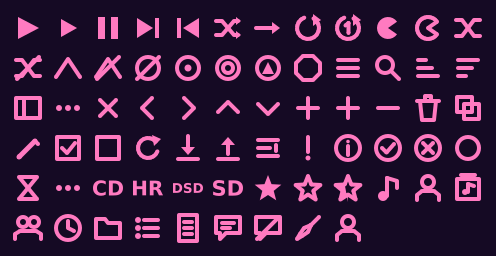
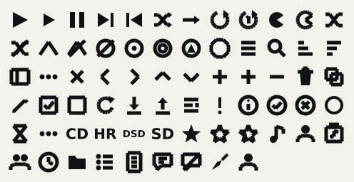
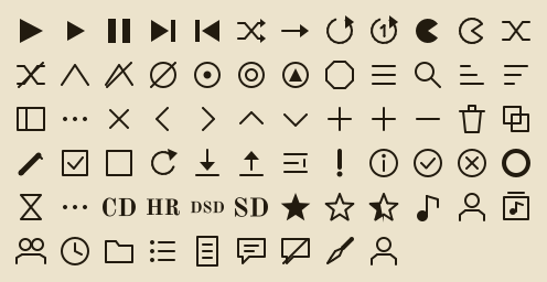
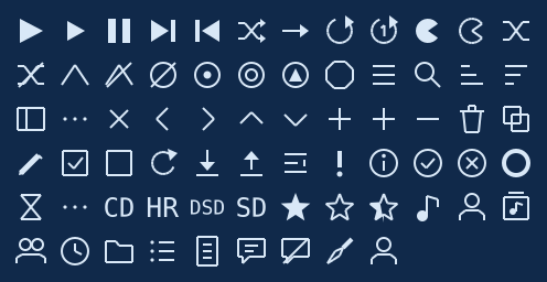
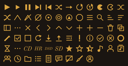
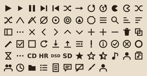
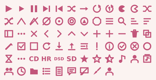
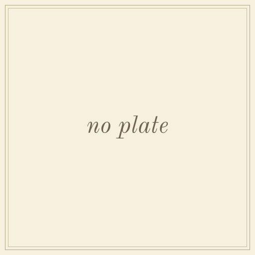
Each theme names an icon set with @icons, searched ahead of the stock icons while it is active — so a theme differs in concept, not only in weight. Every set is generated from one geometry spec per icon by tools/gen_icons.py, rendered as fill-only paths so GTK's symbolic recolouring always applies. Each ships a 512-pixel album-art plate in its own idiom.
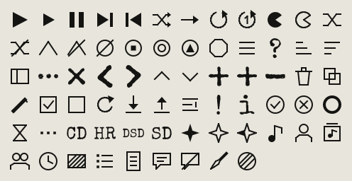
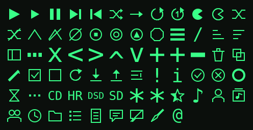
Broadsheet and Reversed Spine icon set
dttw · typewriter glyphs, hairline rules, ✦ stars
Terminal icon set
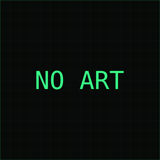
terminal · one-pixel, square caps, ASCII where it reads
Neon icon set
neon · two-pixel strokes, round caps and joins
Bauhaus icon set
bauhaus · solid geometry, heavy bars
Folio icon set
folio · engraver's hairlines, round terminals
Blueprint icon set
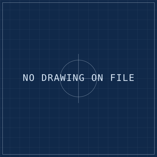
blueprint · pen-plotter hairlines, butt caps
Nocturne icon set
nocturne · inked hairlines, engraved bust avatar
Cassette icon set
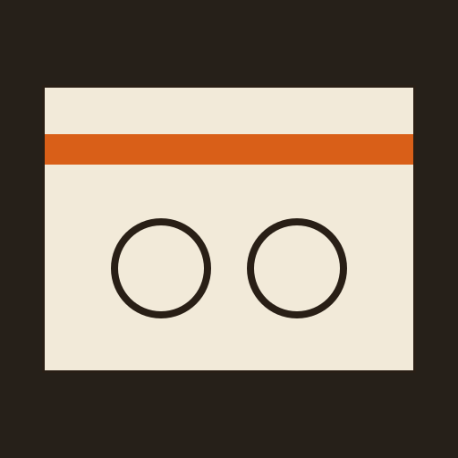
cassette · silk-screened pictograms, filled and rounded
Marshmallow icon set
marshmallow · plump strokes, closed shapes filled
Album-art plates
dttw placeholder plate terminal placeholder plate neon placeholder plate bauhaus placeholder plate folio placeholder plate blueprint placeholder plate nocturne placeholder plate cassette placeholder plate marshmallow placeholder plate